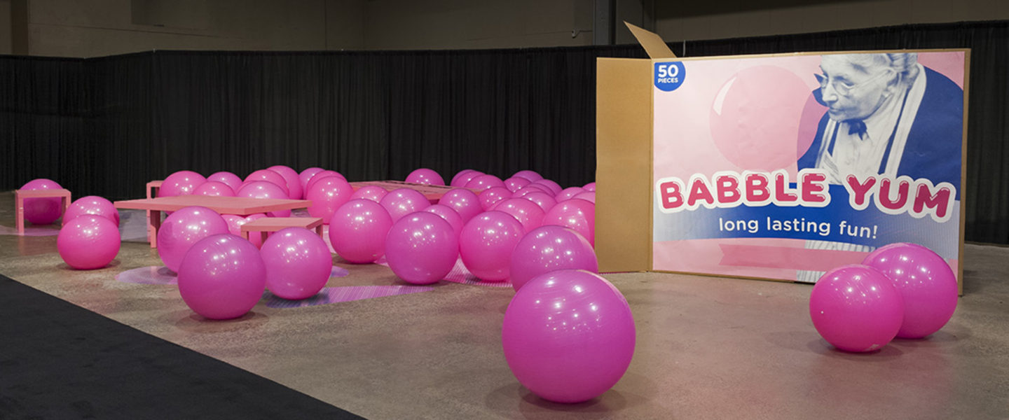
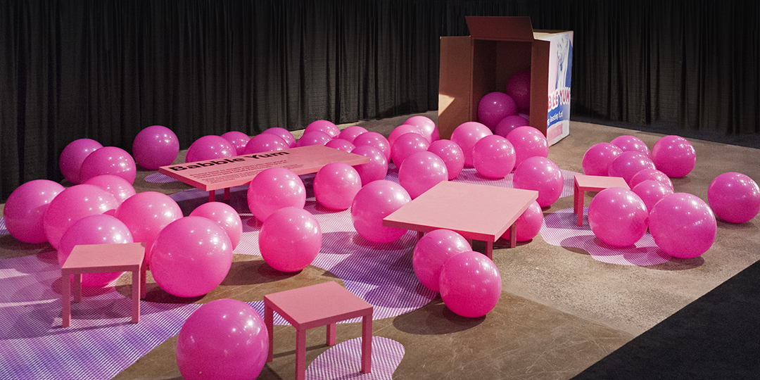
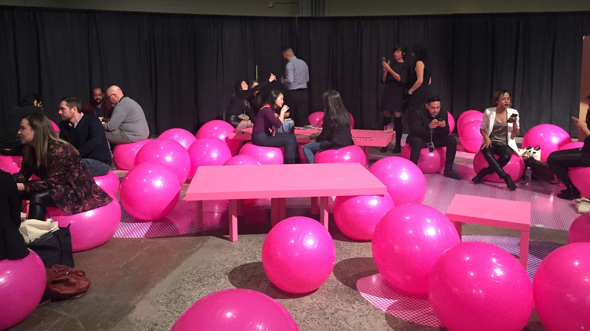
Babble Yum is one of five central common spaces conceived for the Toronto Interior Design Show 2018 under the show’s theme of “Future Fantastic” on a shoestring budget. The strategy for the design of the five spaces was not to predict the future but rather to provide environments that enable the creativity, conversations and collaboration that ultimately shapes the future – environments that will encourage thought that pushes the envelope and inspires disruptive, revolutionary ideas. A core belief behind the strategy is that collaboration is essential; contrasting, parallel points of view are what’s needed to push the world forward. Each design team was asked to explore a contrast of their choice as part of their design: One & Many, Plus & Minus, Quiet & Loud, Alone & Together and More & Less. Babble Yum explores the contrast of One & Many.
Conceptually, Babble Yum was approached as a space design challenge, allowing the design team to thoughtfully address the strategy and embrace the tiny budget. This resulted in a lighthearted and youthful counterpoint to the very adult spaces displayed throughout the trade show.
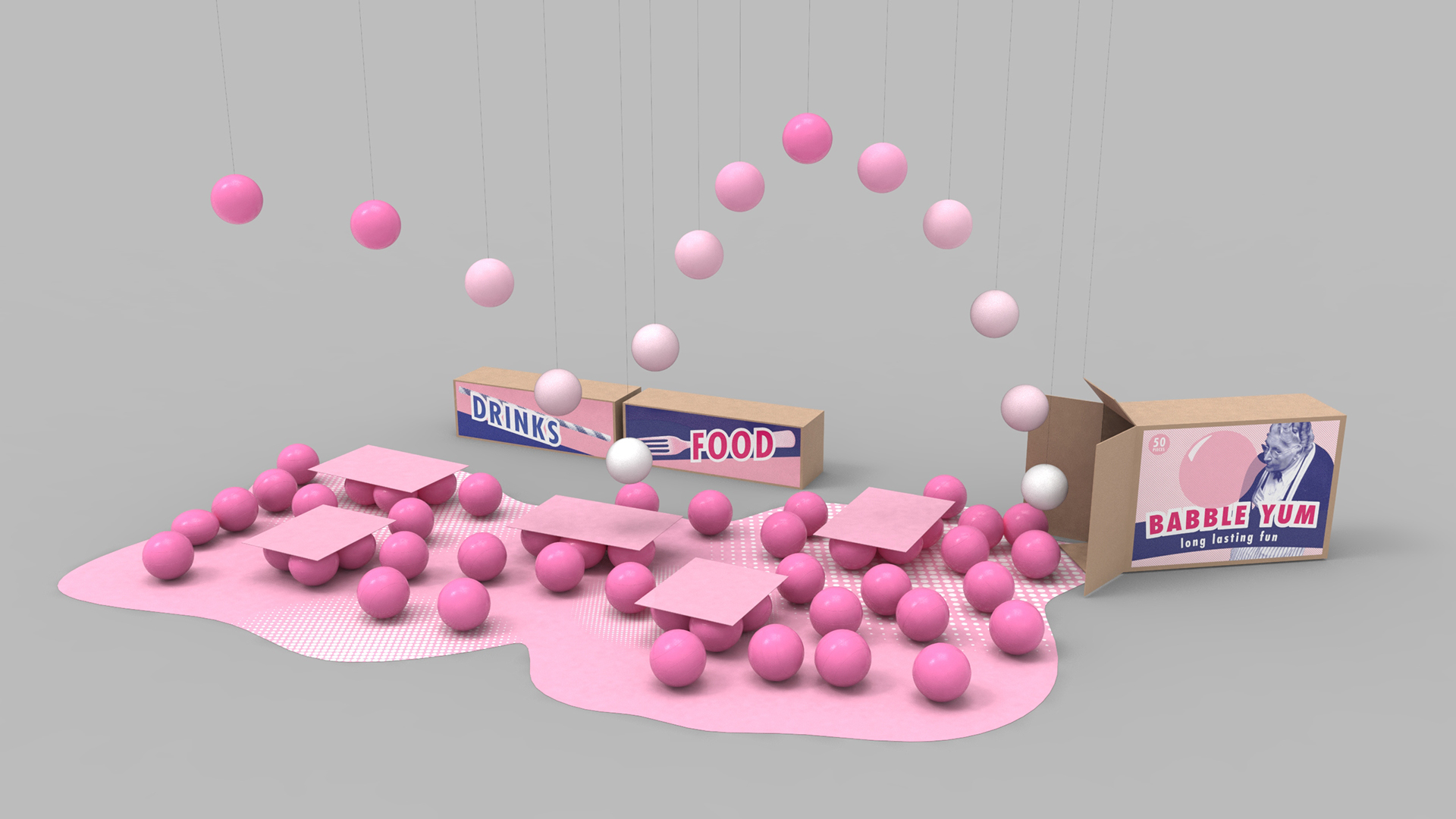
Babble Yum is a space conceived to encourage both intellectual and physical play. Working with the considerations of a small budget, the user-experience need to reset from the seriousness of a tradeshow and the fact that food and drink would be served in the space, the design team set out to achieve the maximum effect with limited resources. By using common objects in uncommon ways, they aimed to tell a story where every element contributes to the message.
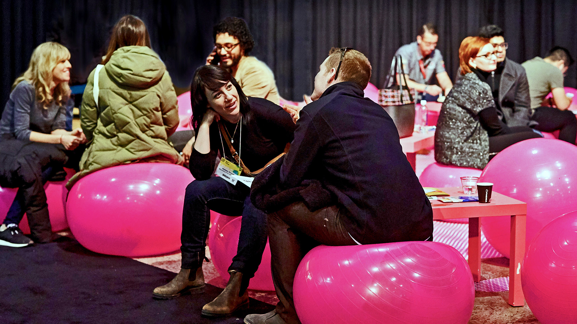
Babble (a place to converse) Yum (a place to eat and drink) grew out of the idea for an affordable seating solution that was fun and different – hot pink yoga balls. Each one was partially filled with water to prevent them from scattering at the slightest touch, giving their movement a random “life of their own” effect that added to the story of play. And because they were not stationary, the space changed with each new person or group who occupied it.
Adults approaching Babble Yum often needed a moment to visually calibrate how to interact with the space, while children (who otherwise had nothing to engage them in the entire trade show) dove right in. The concept proved to be such a hit with children and parents that it has prompted discussions of using the design as a pop up ice cream shop/experience.
The joyful exuberance of the space allowed everyone who experienced it to smile and come away feeling refreshed. Some, the design team hopes, came away feeling inspired. An observation that drove Babble Yum’s concept was the fact that styles and trends, proliferated by the likes of Pinterest and Instagram, are resulting in spaces all over the world looking and feeling the same; a symptom of groupthink. Babble Yum not so subtly sends the message that originality is far more interesting and ultimately more important than following a trend.

