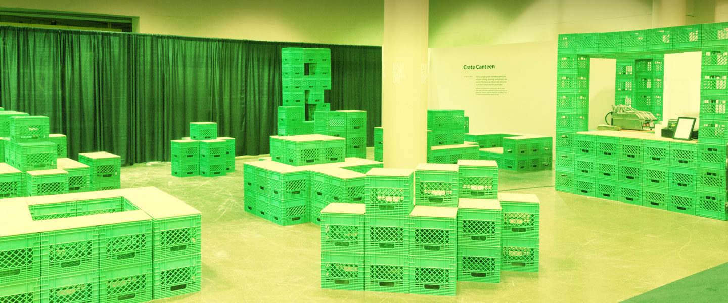
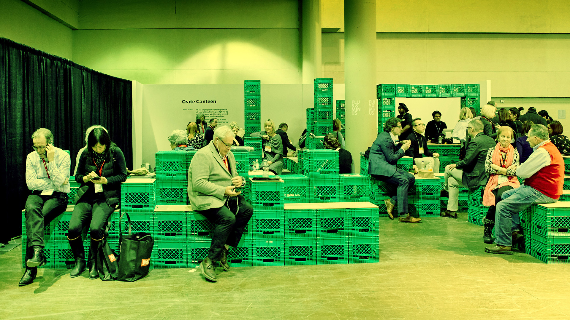
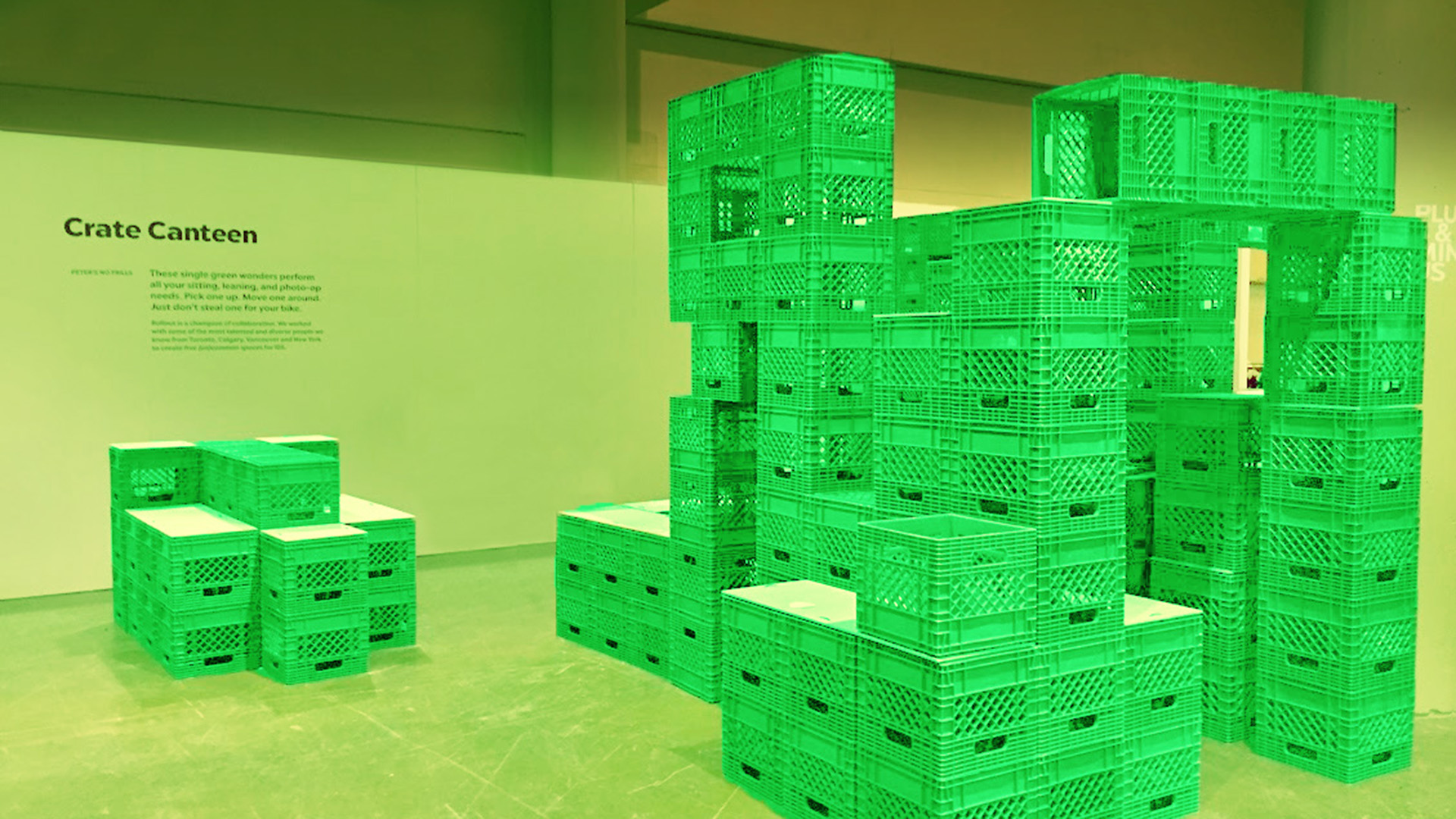
Crate Canteen is one of five central common spaces conceived for the Toronto Interior Design Show 2018 under the show’s theme of “Future Fantastic” on an extremely small budget. The strategy for the design of the five spaces was not to predict the future but rather to provide environments that enable the creativity, conversations and collaboration that ultimately shapes the future – environments that will encourage thought that pushes the envelope and inspires disruptive, revolutionary ideas. Conceptually, Crate Canteen was approached both as a guerilla art installation and a space design challenge, allowing the design team to both thoughtfully address the strategy and embrace the tiny budget. This resulted in a meaningful and playful counterpoint to the feel of the perfected, expensive spaces displayed throughout the trade show.
Crate Canteen is a space designed to juxtapose the omnipresent consumerism trade shows are put on to promote and embrace. The most expensive materials, the latest trends, the most sought-after colours, the greatest finishes, and everything new, new, new. But creativity and problem solving have nothing to do with any of these things. This led the design team to a concept for the most “no frills’ public space possible using materials that can only be described as common.
One of the driving ideas behind the space was to use the tiny budget as part of the concept – to show that it was possible to have a fully functional and welcoming public seating space worthy of talk value, but without a single bell or whistle. Also, Crate Canteen’s location within the Interior Design Show required that it be the last area in the entire show to be installed and the first removed. So “quick and easy to assemble and dismantle” became a key design objective.
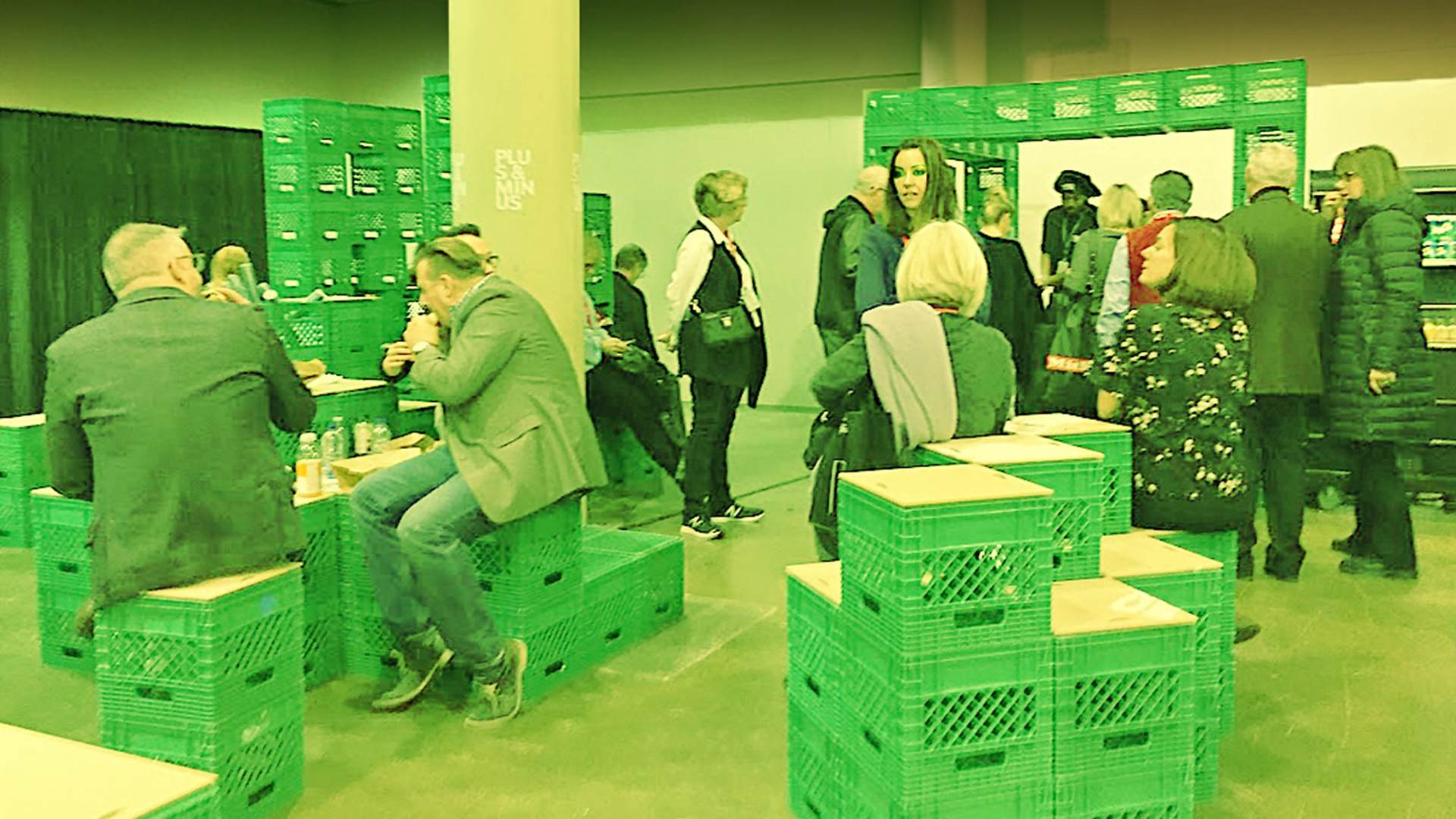
Over a period of a few weeks, the design team collected hundreds of free milk crates from their local grocery store, turning their studio into a green crate forest as they experimented with endless configurations. It was important to the team to push the envelope and reject traditional “table and chairs” type seating, and instead make it comfortable and inviting non-traditionally, offering multiple seating or standing possibilities, both private and group oriented. Most of all, they wanted the space to be customizable for the type of person or group you are. The result was an imaginative, multi-functional public space with a fully functioning bar that served everything – but milk.
While the concept for Crate Canteen isn’t “anti-consumerism”, its goal is to spark in those who experience it, the notion that glossy, sleek, expensive and new aren’t what’s needed to push the world forward. In fact, they can be crutches. The most interesting solution to a problem is often the simplest.


