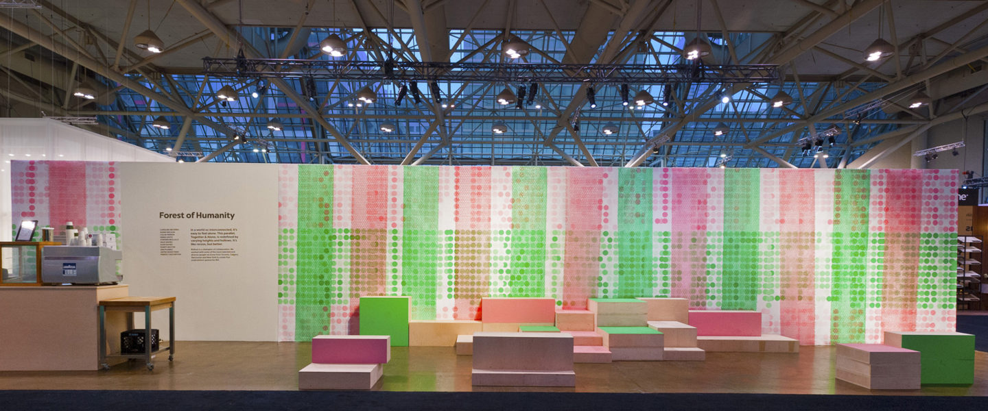
Forest of Humanity is one of five central common spaces conceived for the Toronto Interior Design Show 2018 under the show’s theme of “Future Fantastic” on a very small budget. The strategy for the design of the five spaces was not to predict the future but rather to provide environments that enable the creativity, conversations and collaboration that ultimately shape the future – environments that will encourage thought that pushes the envelope and inspire disruptive, revolutionary ideas. A core belief behind the strategy is that collaboration is essential; contrasting, parallel points of view are what’s needed to push the world forward. Each design team was asked to choose a contrast to address as part of their exploration: One & Many, Plus & Minus, Quiet & Loud, Alone & Together and More & Less. Forest of Humanity explores the contrast of Alone & Together.
Conceptually, Forest of Humanity was approached as a meditation on the interconnectedness of humanity and explores the contrasting needs of our nature as individual beings. The concept confronts the fact that despite our hyper-connectedness through technology, we can easily lose our sense of connection as human beings and feel alone.
Forest of Humanity takes its inspiration from the communication network that exists in the forest between trees. Ecologists have discovered that trees communicate their needs and send each other nutrients via a network of latticed fungi buried in the soil. “All the trees in the forest are connected below ground. They behave like communities. They’re a forest, not just a bunch of trees,” says ecologist Susan Simmard. The design team set out to create a space that provided a structure that symbolized this concept for humanity.
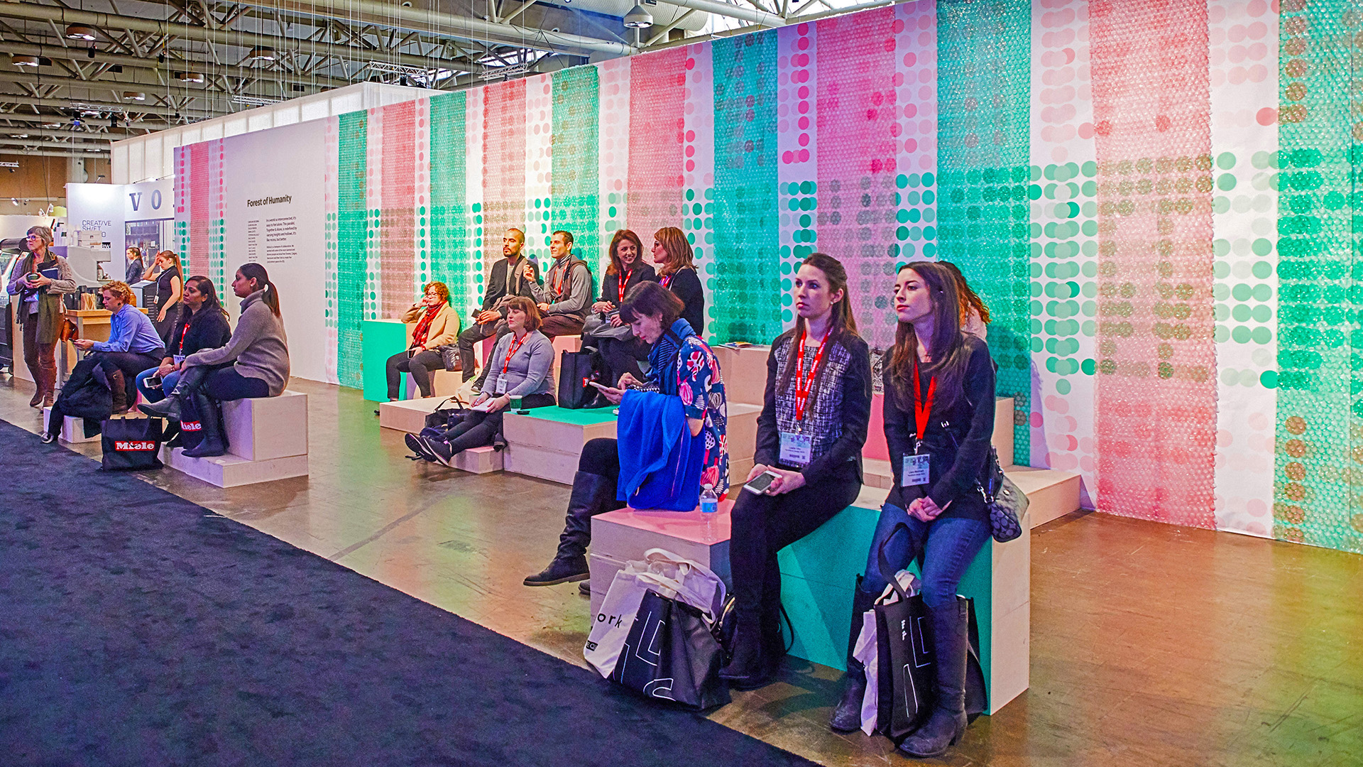
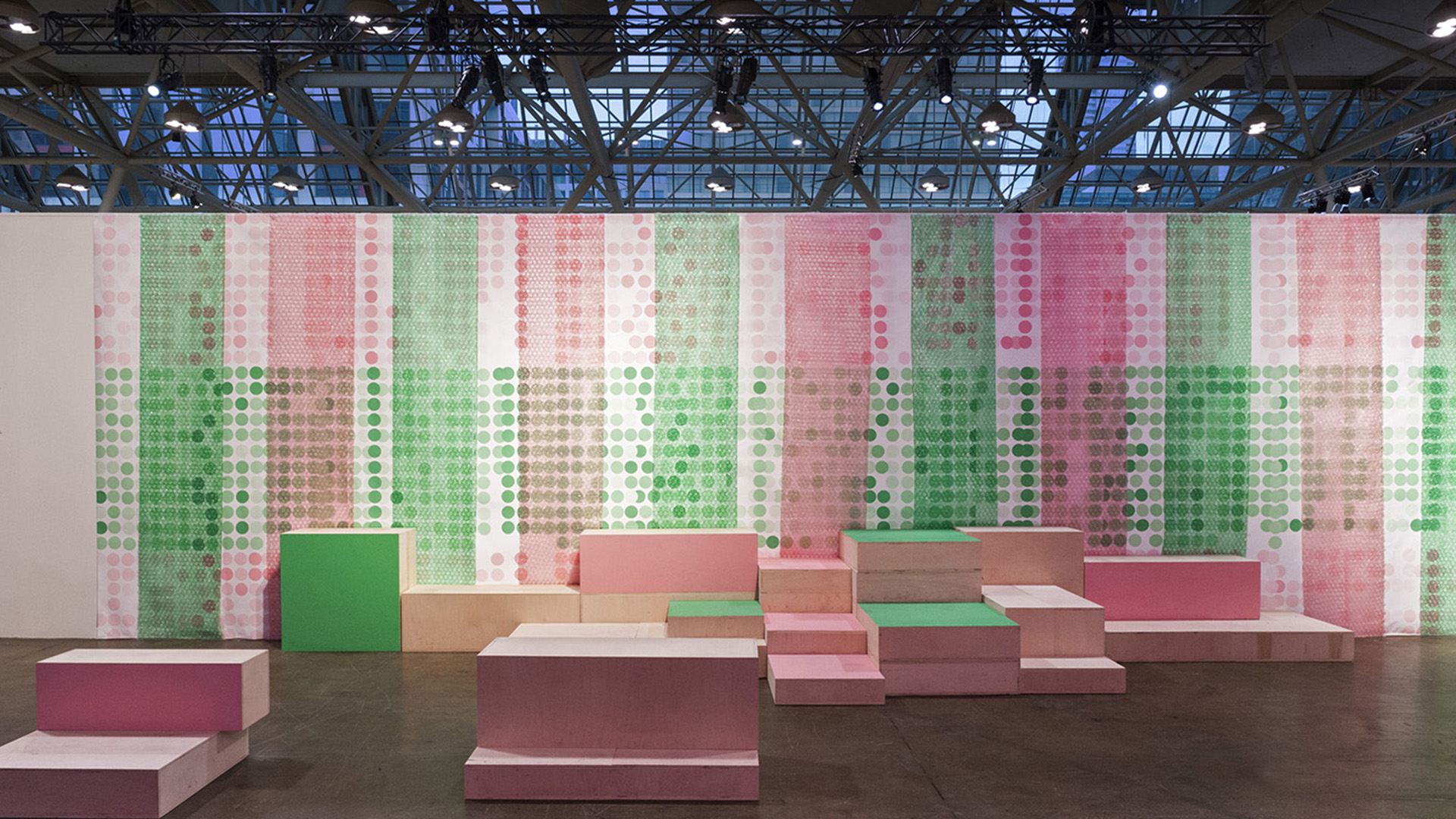
Bleachers were conceived to mirror a network of roots beneath our bodies that connect us. The spacing of the steps suggest the social webs interaction creates. The bleachers invite congregation by being casual; no one feels they are interrupting gatherings or feels awkward sitting in close proximity to anyone – allowing people to sit together, even if they’re not “together”. The design team wanted to create a space that encouraged relaxed conversations in small groups, but equally, they wanted to encourage people who wanted to spend some time on their own to be able to participate in the same environment comfortably.
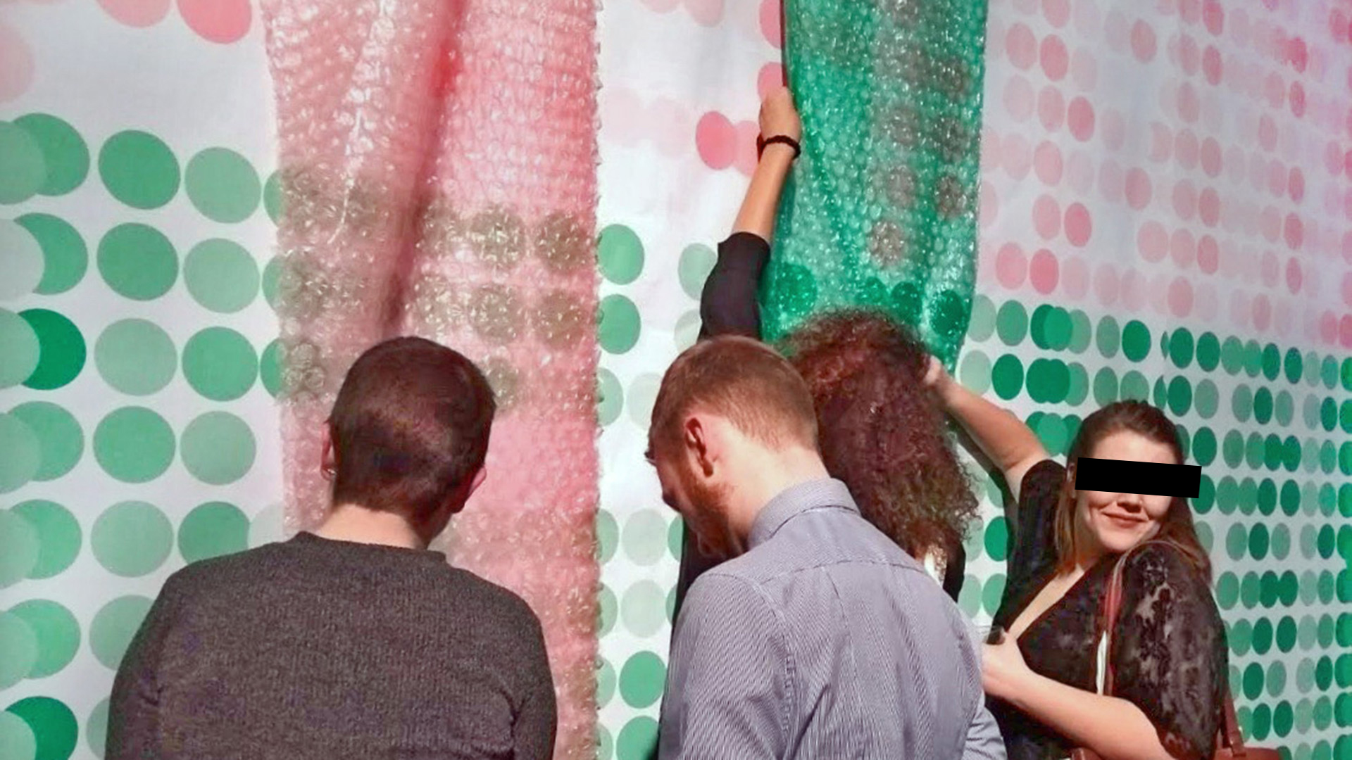
Embracing the small budget, the design team used dots to symbolize the network concept and to add dimension to the space. Bubble wrap was layered on top both to create visual texture. Popping the bubbles was encouraged, providing an activity that invites connection and generates laughter.
Forest of Humanity proved to be an inviting space that many at the trade show gravitated to. The simplicity of the modular bleacher concept subtly yet successfully communicated the message that like trees, we aren’t just a bunch of individuals, we are a connected forest of humanity. For the design team, the insight that being human is the ultimate community is something worth remembering and respecting as the world pushes forward.


