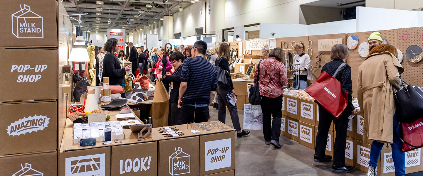
At the 2020 Interior Design Show in Toronto, the popular design blog Design Milk needed a custom installation to host their pop-up retail space, the Milk Stand. Their goal was to build a physical space to highlight their impressive roster of artisans and their wares that would be inviting and engaging to IDS attendees; it would be a place to stop, relax, browse and buy, all while creating a unique sense of personality that fit with the brand built by Design Milk and its founder, Jaime Derringer. This is where Rollout came in.
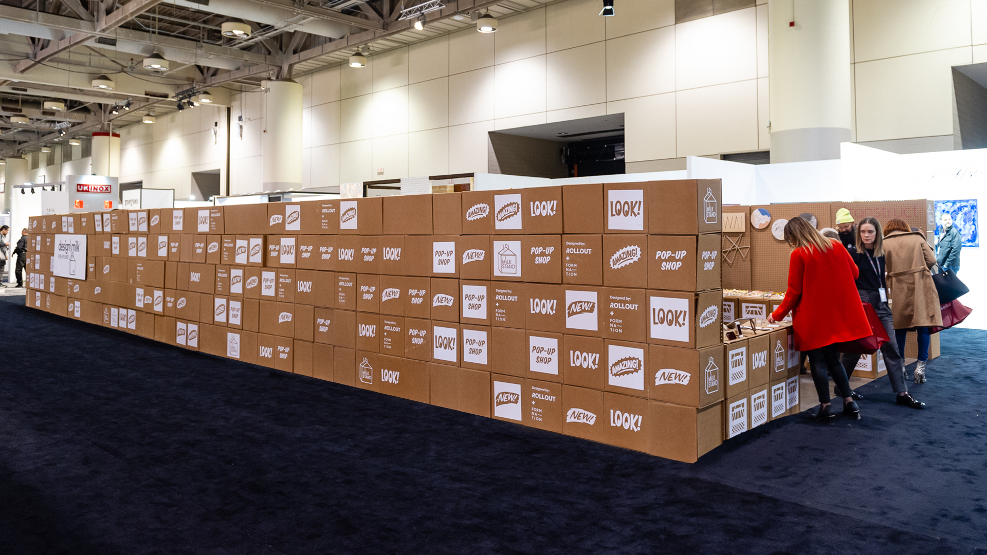
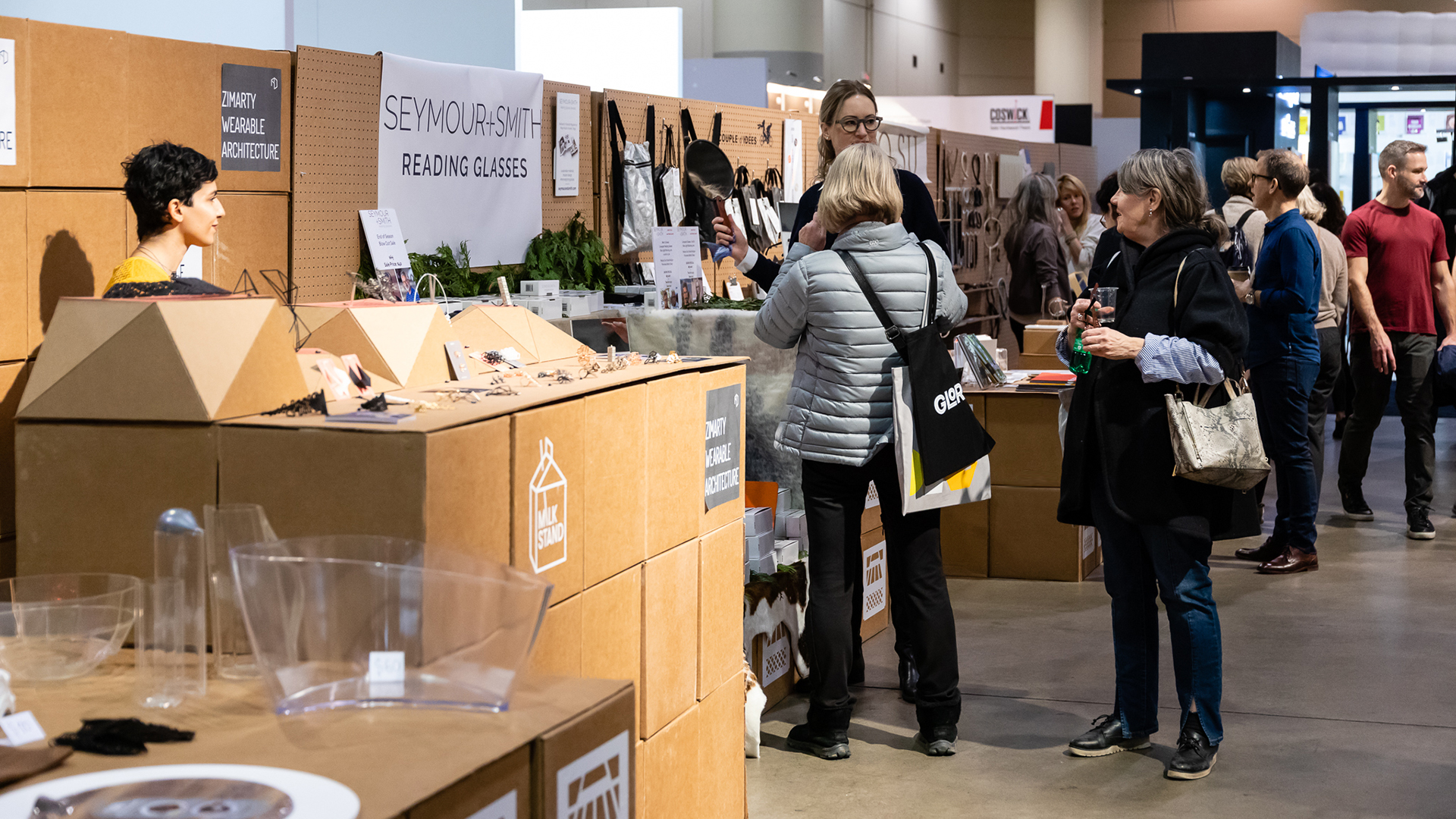
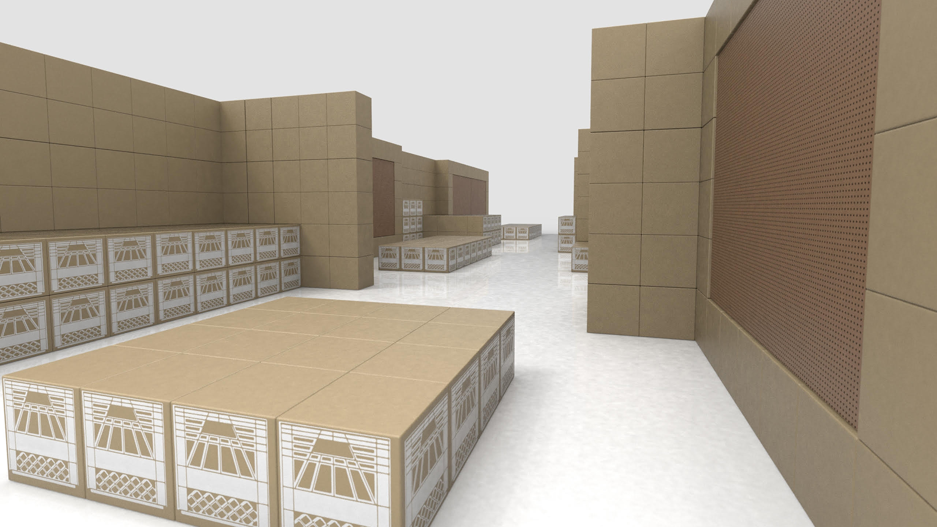
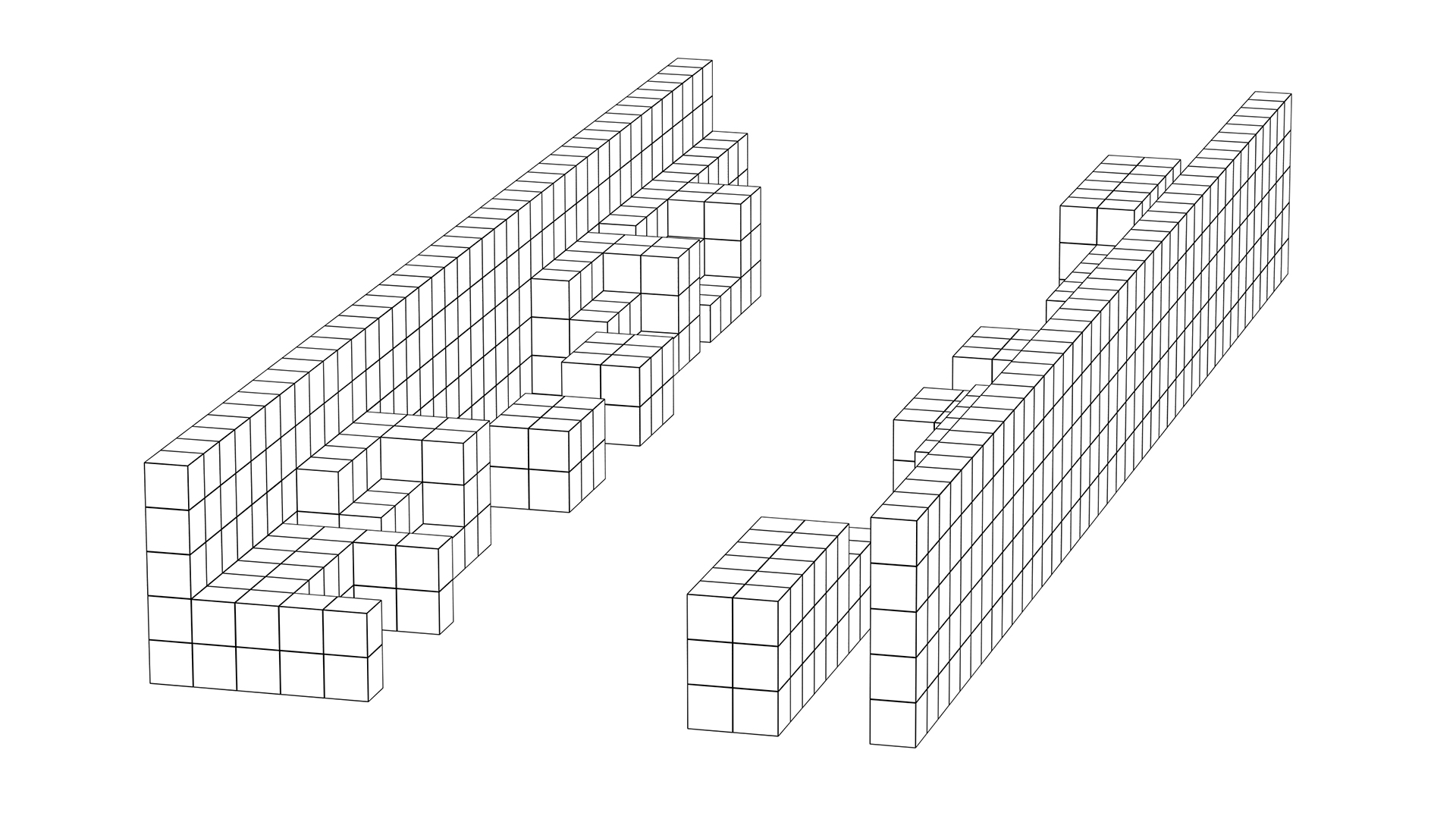
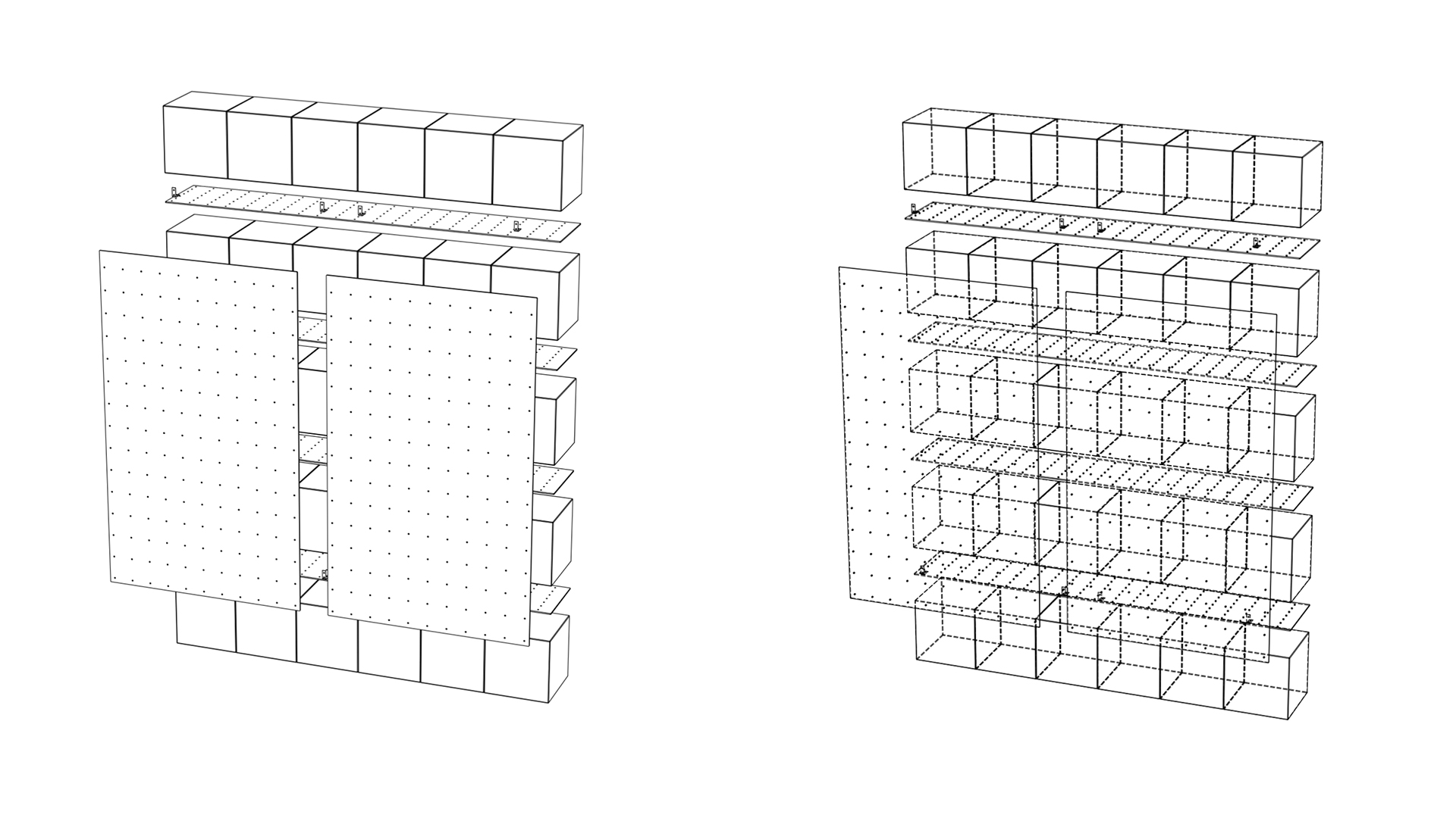
With a modest budget but unlimited creativity, Rollout partnered with multidisciplinary design firm FormNation to come up with a concept that blended practicality with innovation and pristine products with DIY charm. By the opening of the Interior Design Show, we turned $10,000 into one thousand cardboard boxes with modular plinths and shelving using pegboard and low-cost metal fixings into a customizable display system for 15 talented designers from Canada and the United States.
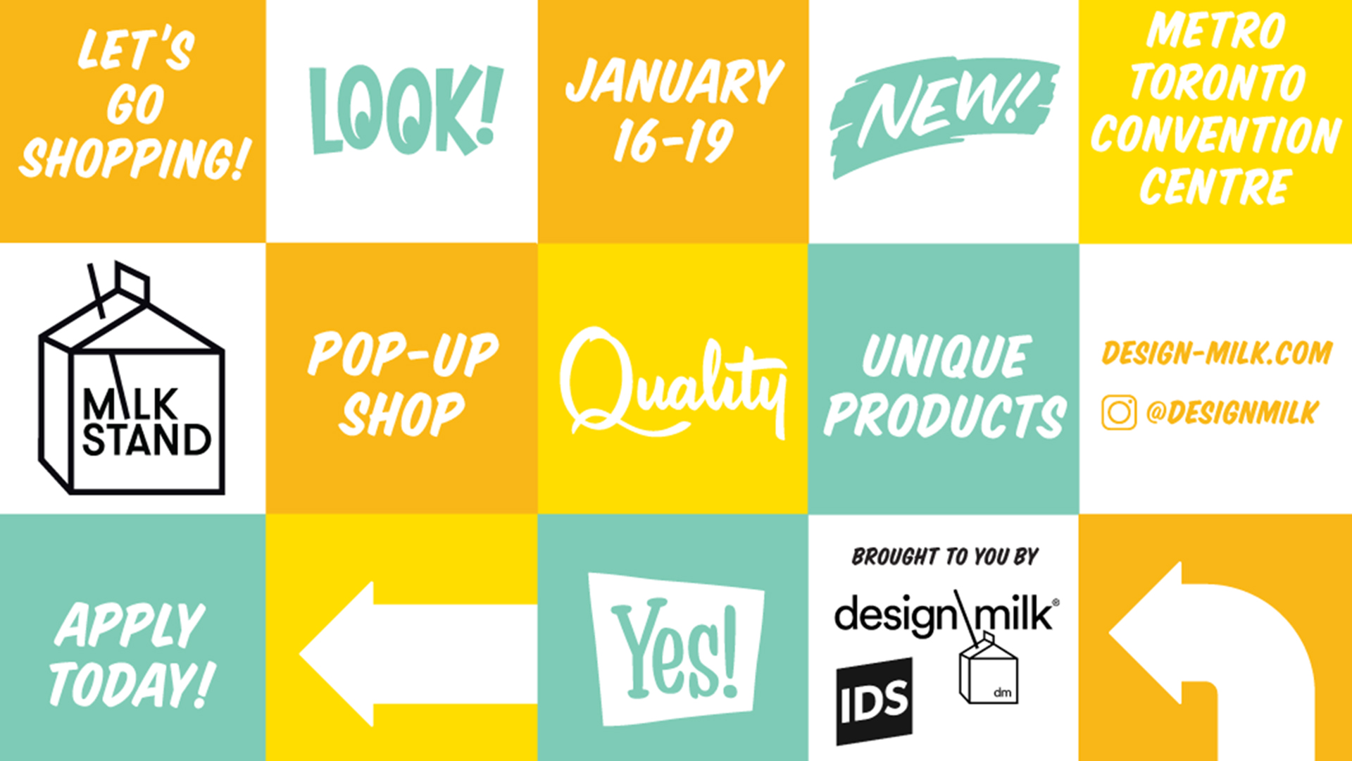
The original inspiration for Rollout’s Milk Stand design came from Design Milk’s promotional material itself: a nostalgic grid with colourful cartoony graphics and fonts. Knowing the Toronto audience that would be flooding IDS, we pushed the aesthetics of discount department stores and neighbourhood arts markets and created the real-life version of Design Milk’s own Milk Stand postcard – only with a more neutral colour scheme, so as not to pull focus from the products for sale.
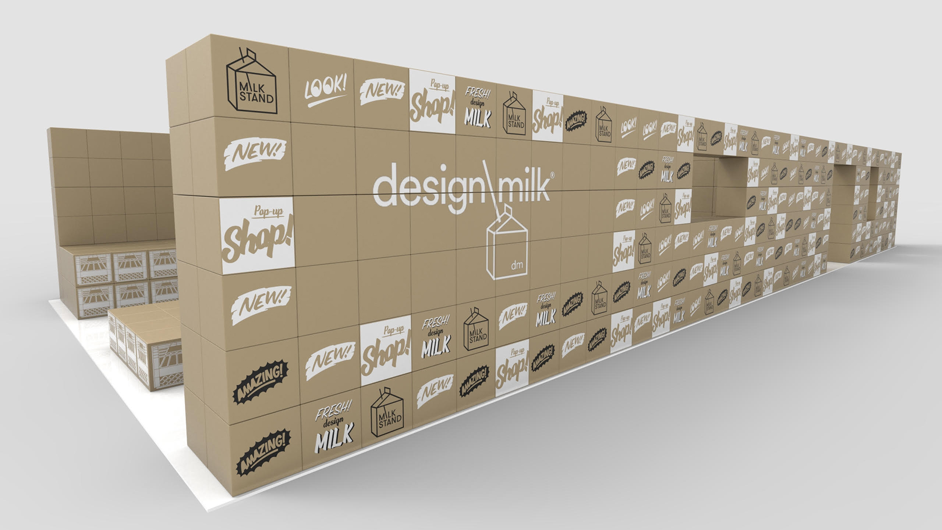
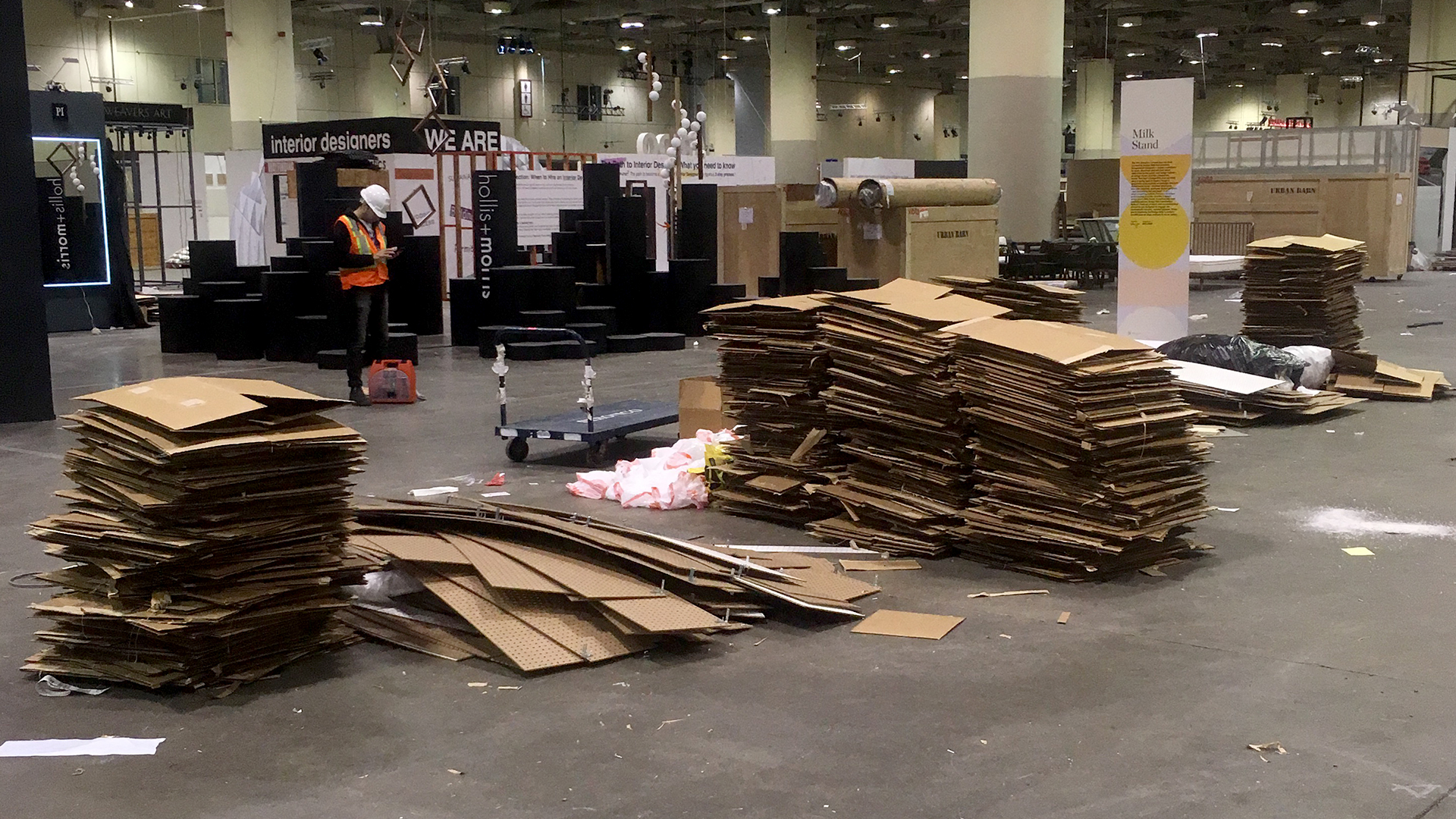
It may look simple, but the process of building the Rollout + FormNation Milk Stand was anything but. First, our team fire proofed and then applied vinyl decals to the boxes with either the Milk Stand or Rollout and FormNation logos, a milk crate façade, or a comic-like exclamation – Look! Amazing! New! – as if Batman wasn’t a crime fighter, but a salesman at the top of his game. Once we got access to the space, we then assembled all of the boxes (using pegboard as a stabilizing layer in between each box) in a formation that would make the space fluid and open for shoppers, yet allow for each retailer to put their own personal touches on their space.
The Rollout + FormNation design for the Design Milk pop-up shop, Milk Stand, was successful experimentation in marrying low-cost materials and nostalgic aesthetics with the elevated curatorial standards of the artists involved. The result was a crowd-pleasing mix of old and new that made new connections between artists and customers. It was a long process, but one thing was clear from the beginning: ordinary was not an option.
Hear what we have to say about it here at 16:07.
These are Design Milk's thoughts.
Nice to be recognized by TreeHugger for our intent!

